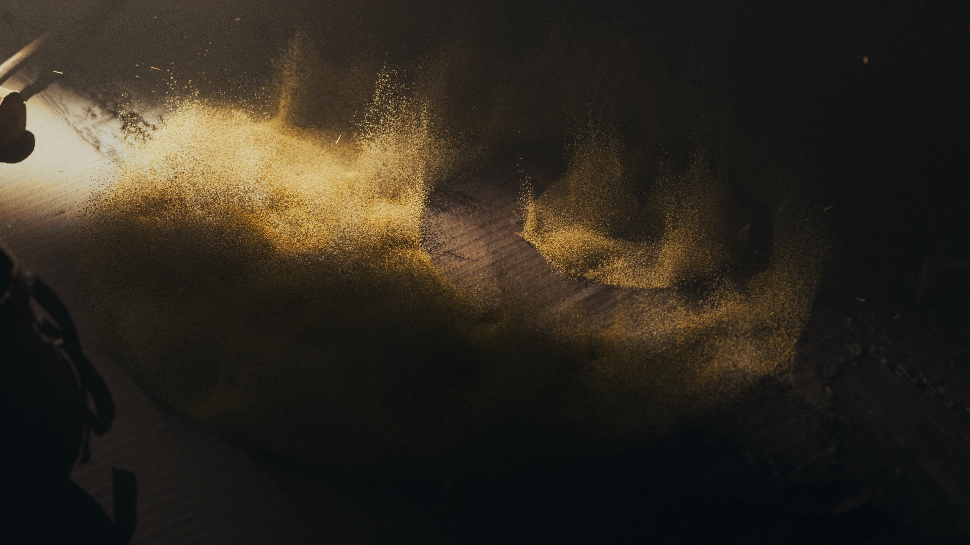
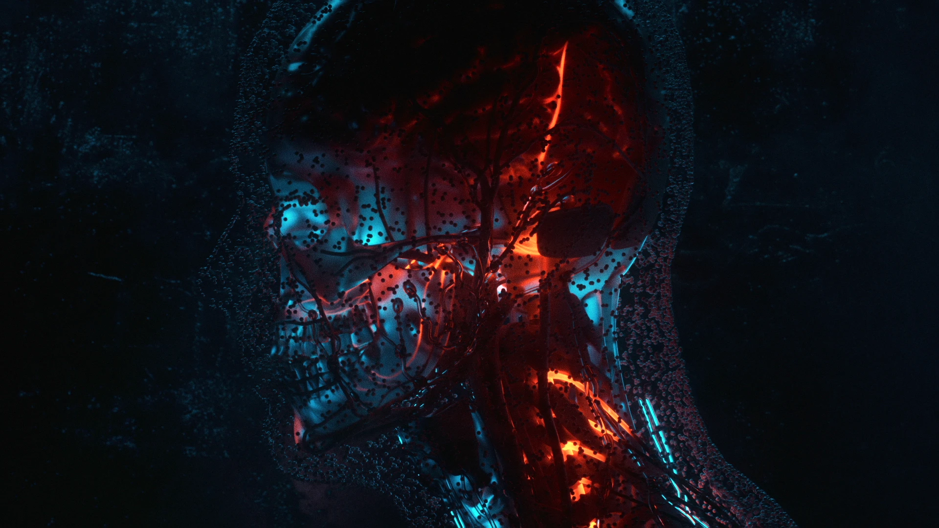
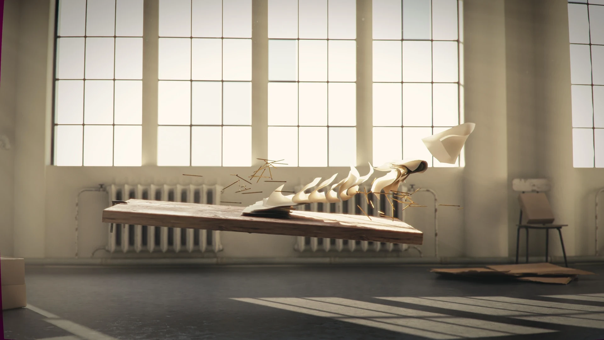
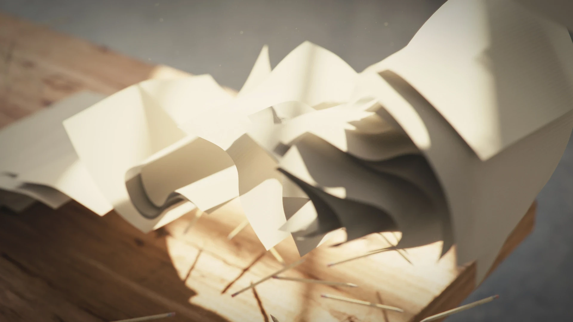
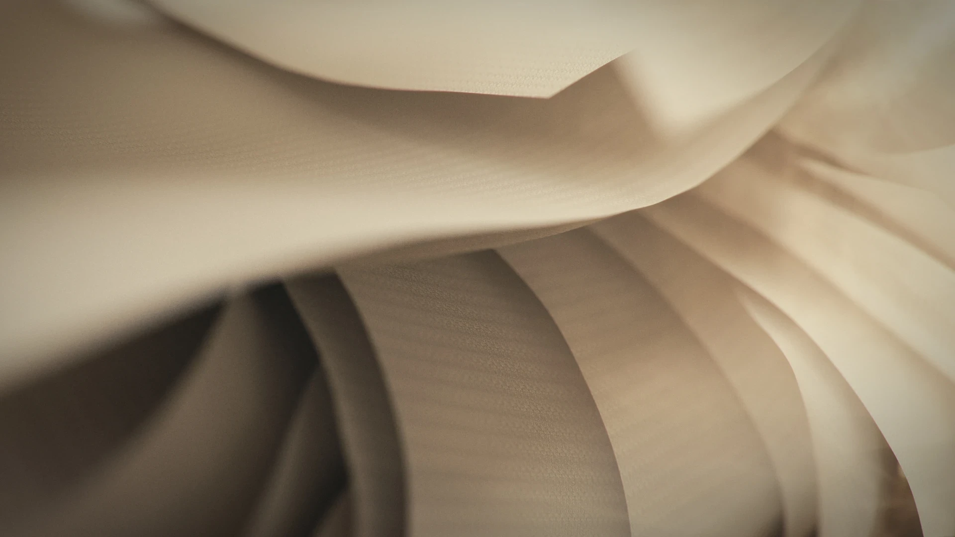
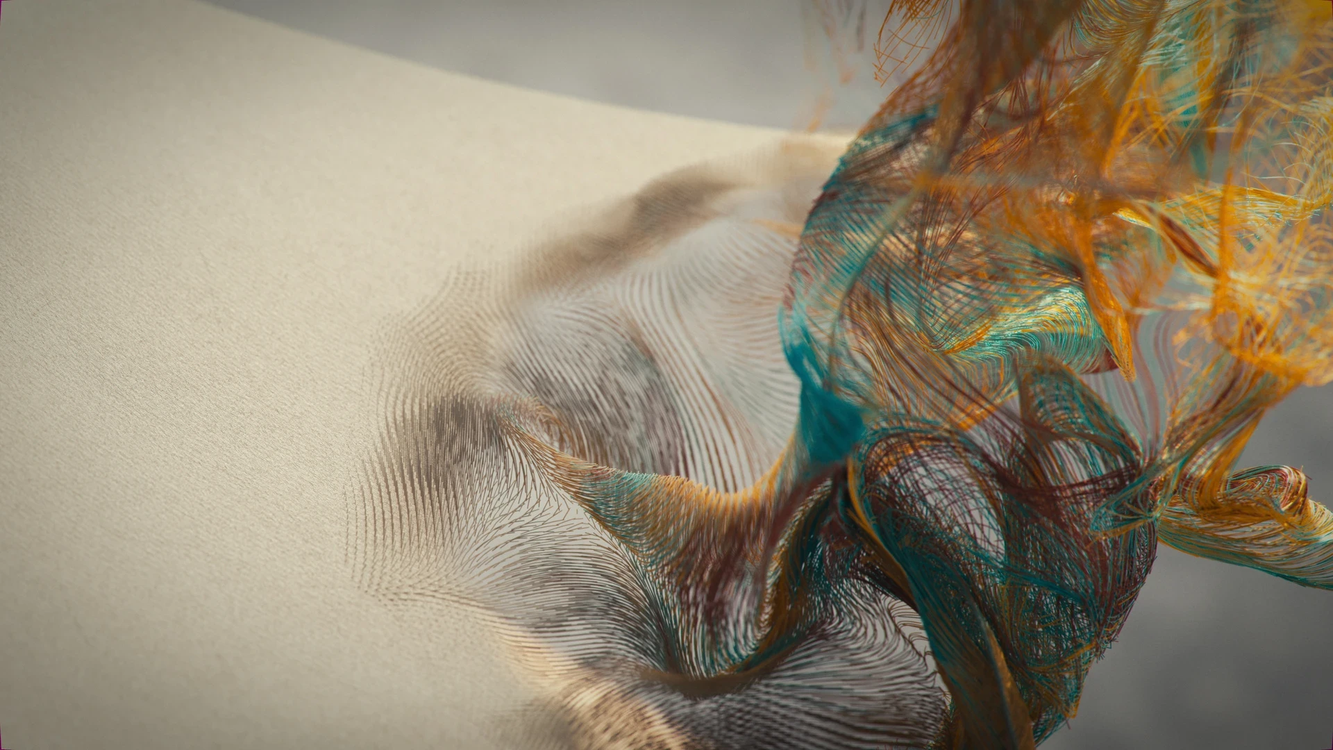
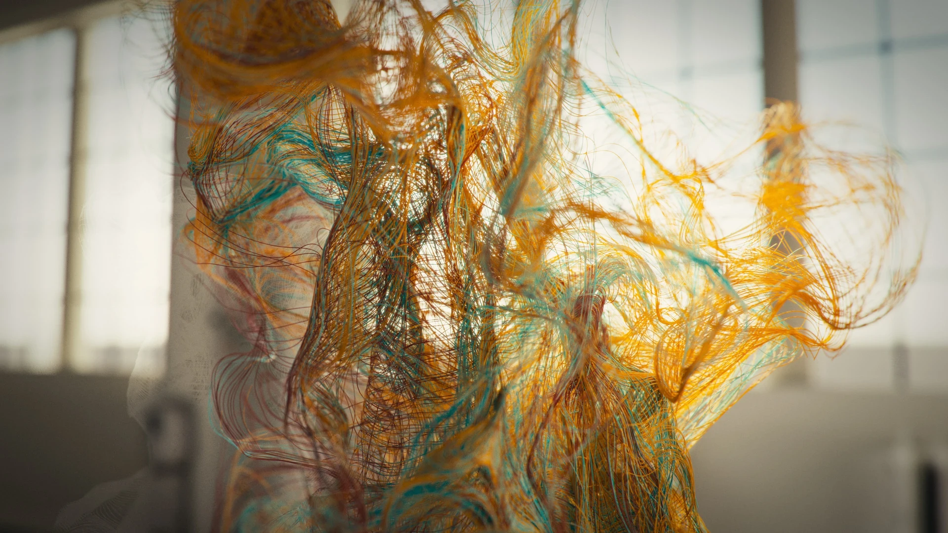
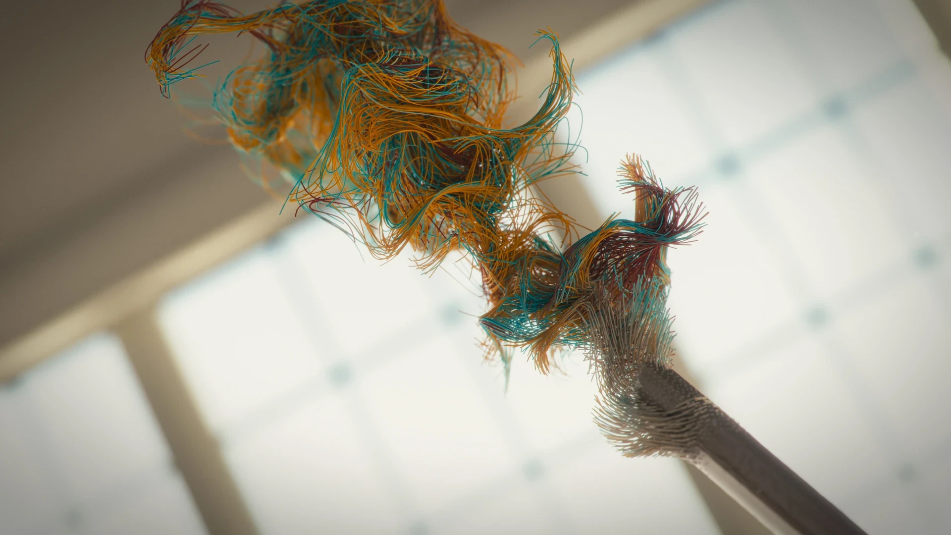
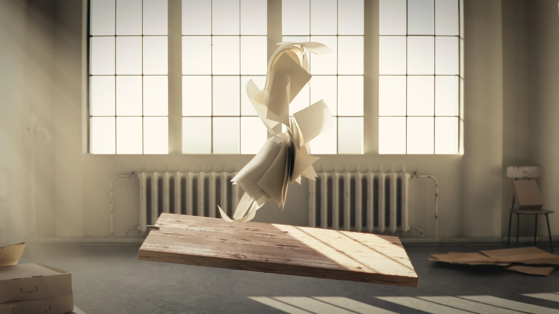
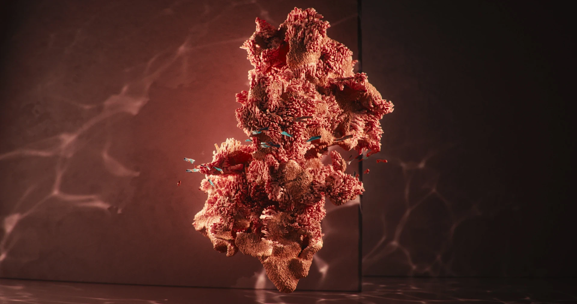
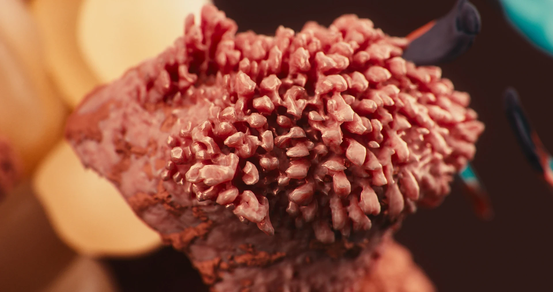
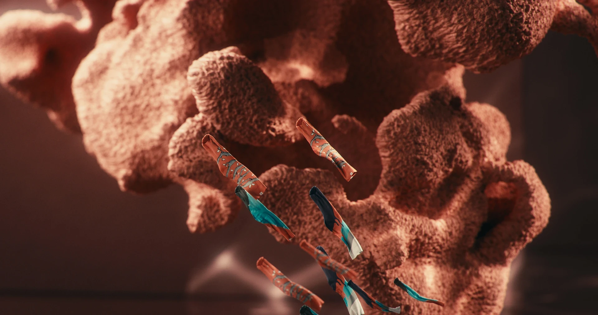
Each colour in the Kaft range is named after a natural material, and the brief was to let each colour carry its own film: no garments, no models. The studio built a separate concept and visual approach for each piece, starting from the logic of the material itself.The series covers four colours: Brick, Sulphur, Coral, and Bone. Each film has a different environment, a different simulation approach, and a different relationship between the material and how it moves.Bone is the base colour in the palette, the colour from which every other shade is built. For the film, which called for a different approach: placing the colour inside a space rather than in front of one. A workshop setting, where the environment carries the colour and the objects within become the subject.
Design & Direction Mert Ercin
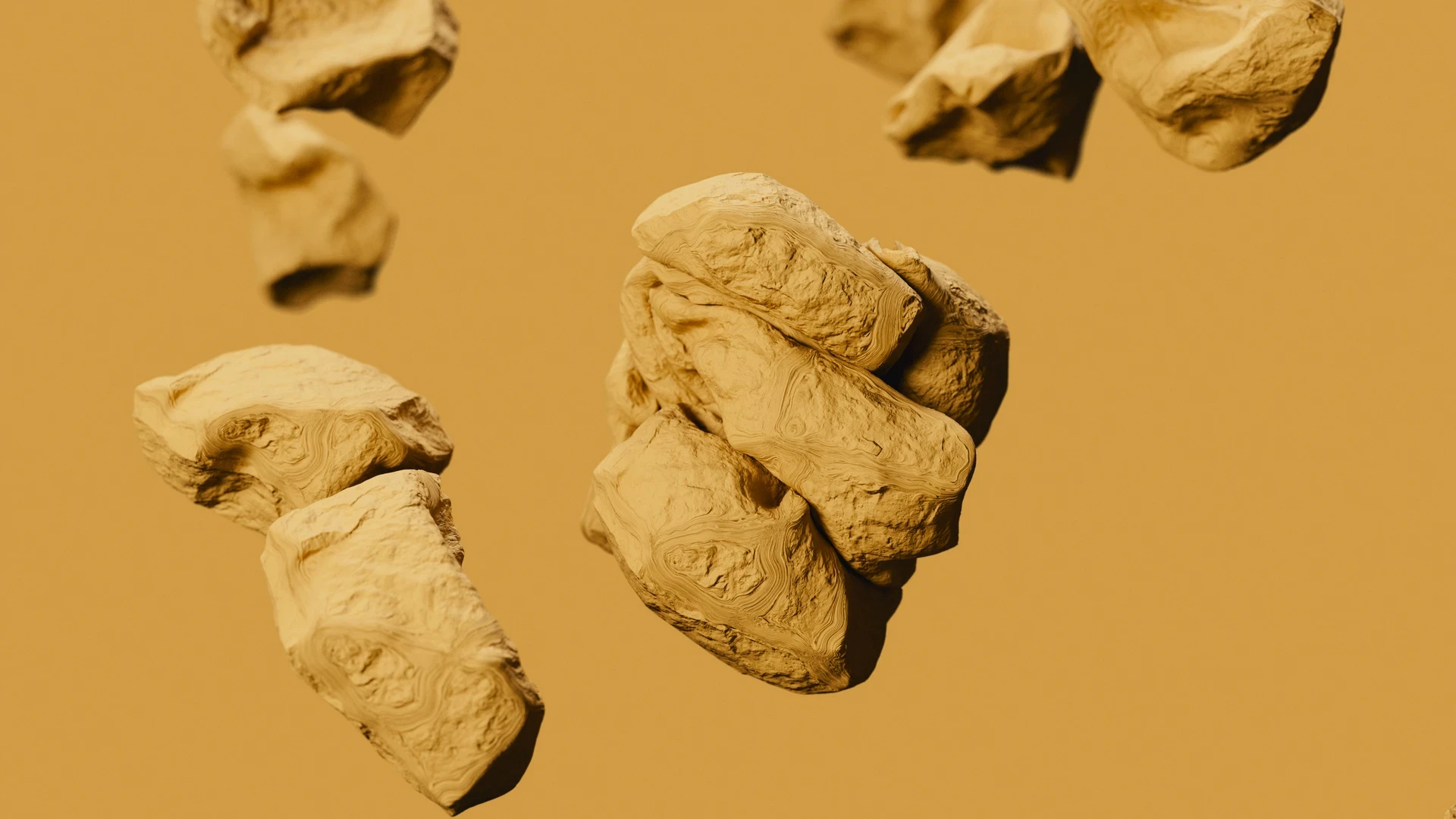
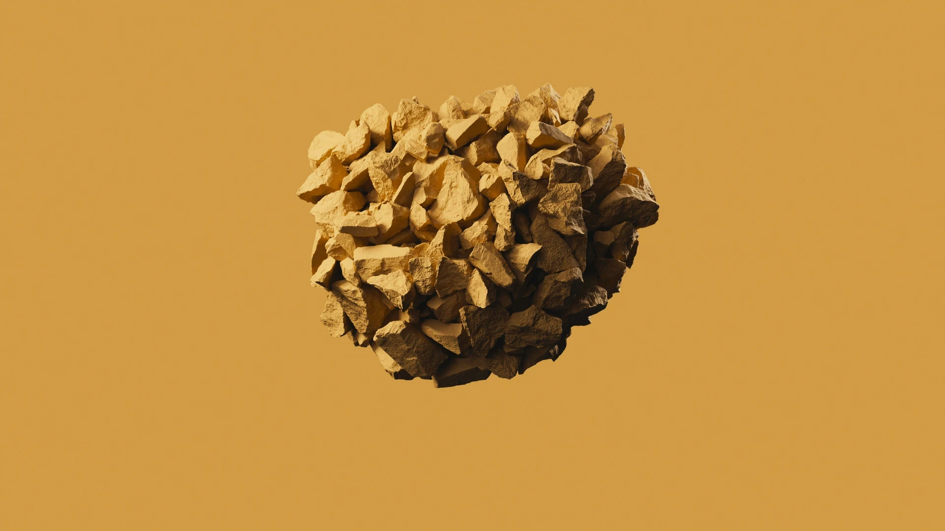
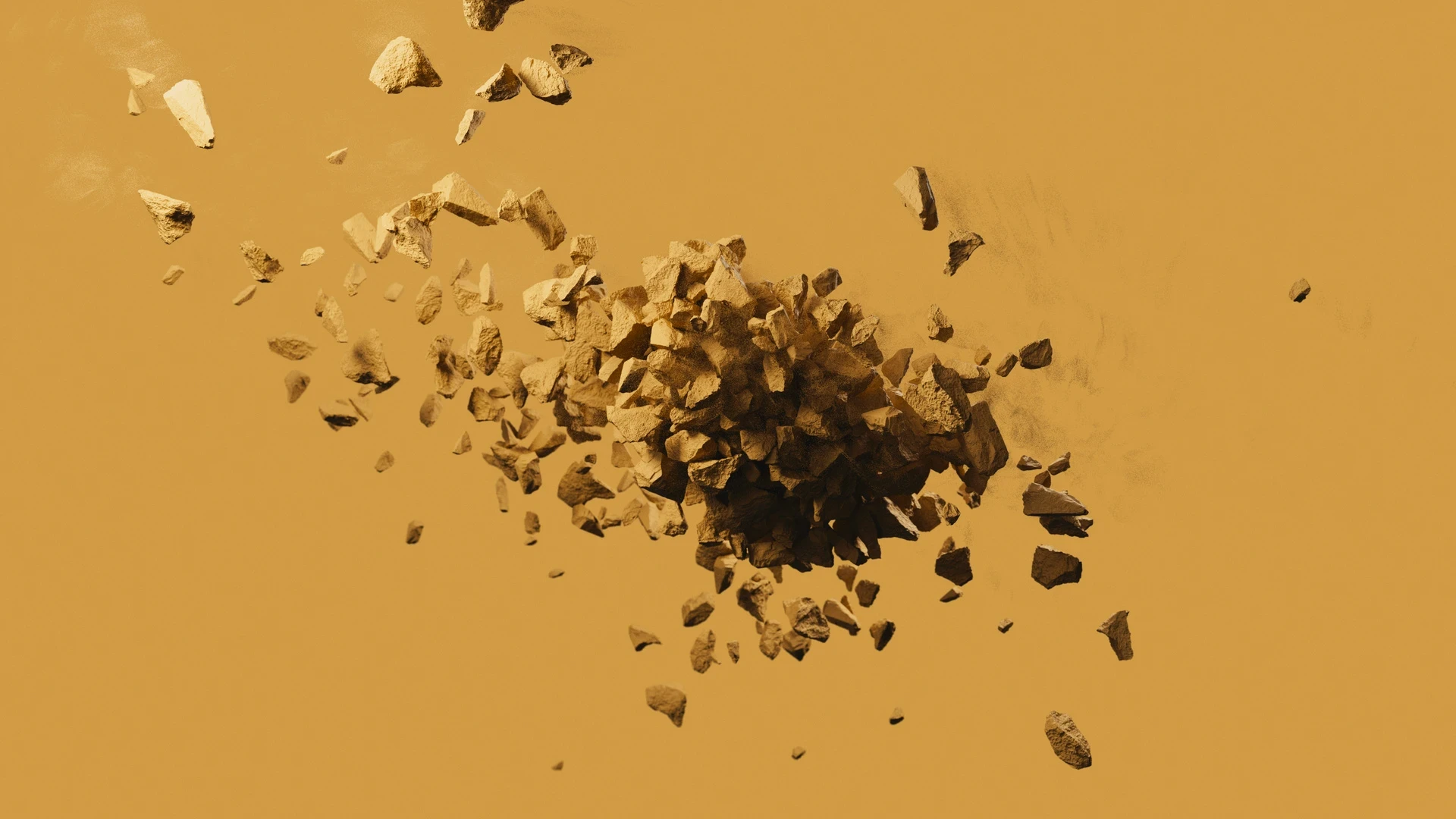
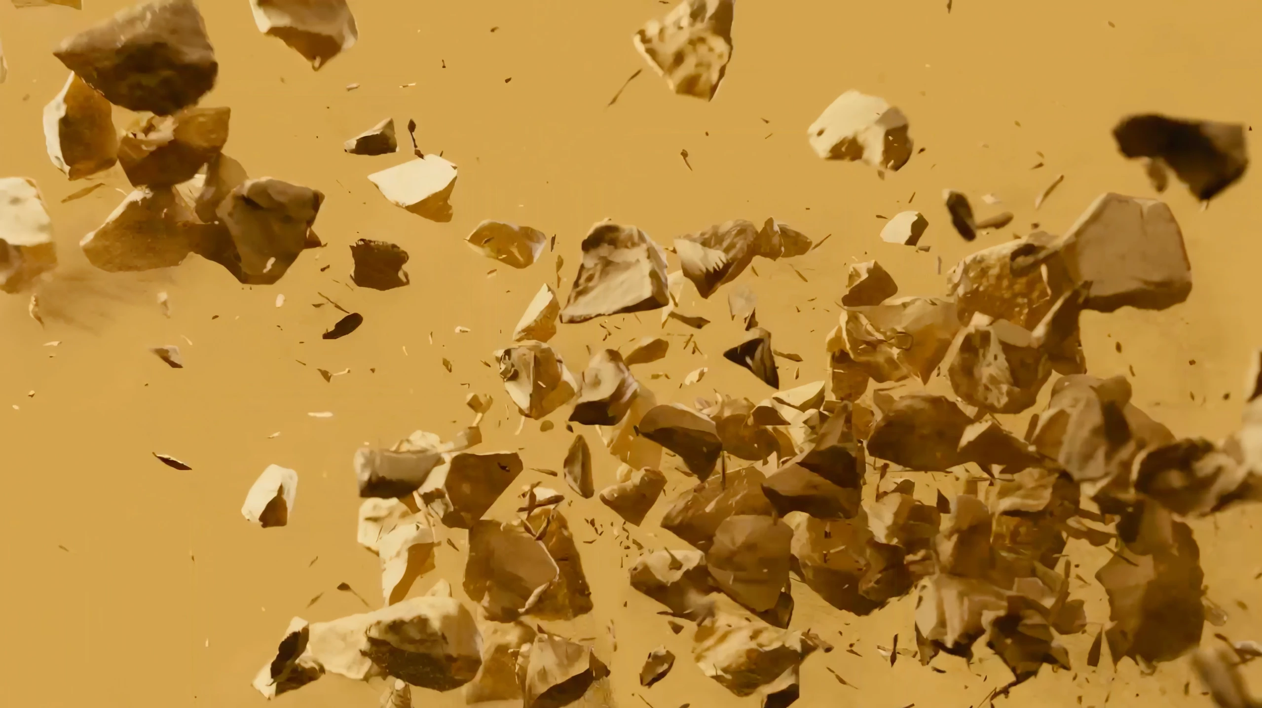
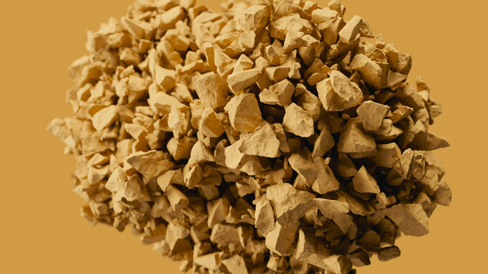
Sulphur is the most energetic colour in the Kaft lineup, named after a substance that burns and destabilises. The film leans into that energy and does nothing serious with it: rocks collide, bounce, and scatter, built as soft-body simulations with more kinetic life than the material suggests.
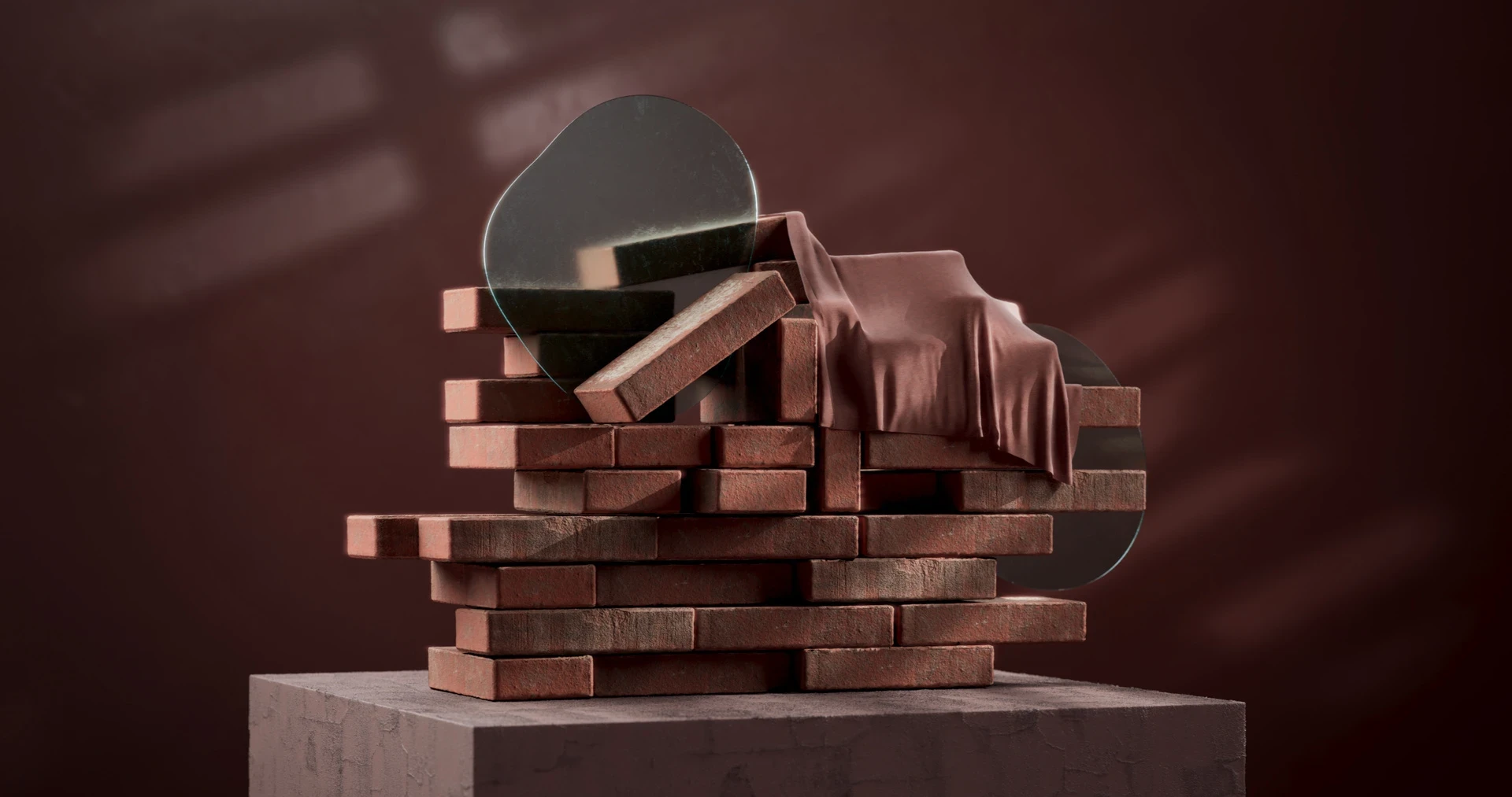
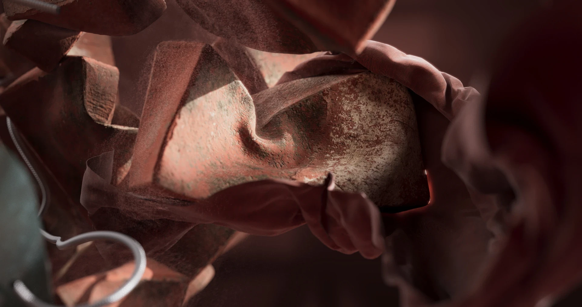
Brick takes its name from fired clay and terracotta. For the film, the bricks go through a physical disruption and settle back into place, built as soft-body simulations that look rigid but move with an unexpected softness
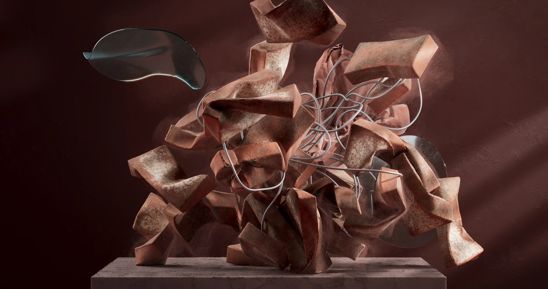
Brick takes its name from fired clay and terracotta. For the film, the bricks go through a physical disruption and settle back into place, built as soft-body simulations that look rigid but move with an unexpected softness
Explore Related Projects1/2